From Summaries

Weekly summaries.

Lifestream summary

Several themes emerged as I tried to summarize and reflect on my participation in this course.

Learning in the open: blogging, tweeting and exchanging resources
Blogging anchored my learning throughout the course, gave me a structure and a schedule to follow. I was initially hesitant to post half-formed ideas publicly, but as the course ran and as I found myself returning to themes and topics I had written about earlier, I found blogging a good way to track my progress. The openness was most helpful when my classmates and I responded to each other’s block assignments. I learned from how they interpreted the same assignment and worked with the same ideas.

Tweeting allowed us to exchange resources but IFTTT for my taste cluttered more than cleared up my lifestream, so I am happy that categorising the posts allowed balance between capturing my engagement and showing progress.

Multimodal opportunities
The opportunity to improve multimodal skills through practice was one of the main reasons I enrolled in this course. While tutors encouraged us to submit digital artefacts for our block assignments, the richness of the course topics themselves provided lots of visual inspiration, practically inviting multimodal play. This is especially true for cyborgs and robots we discussed in Block 1 and algorithms and analytics in Block 3. This richness allowed me to play with different formats: through sketch notes, videos and data visualization.

Although it was at the start of the course, I consider the creating the video Danbo’s day out one of my personal highlights, an example of not just illustrating an idea visually but also interpreting it. By making the video as interesting as I could, I was able to invite multiple interpretations from the audience. Combining this interestingness with an academic argument is one thing I am keen to explore in the final assignment for the course.

A critical attitude towards technology
Looking at cyber, community and algorithmic cultures impressed on me a different perspective on technology. In Block 1, I learned that we humans are not separate from our tools, and that humans and technology are mutually determining.

As an online trainer, I found it tempting to focus solely on the affordances of technology and the constant hype about what technology could offer. How could we use technology to make learning more effective and engaging? However, there is an alternative to this instrumentalist view. Technology represents not just a set of tools but also the product of toolmaking, that is, they represent a particular set of human values, judgements, decisions and negotiations. These idea was introduced in Block 1 and exemplified for me in Block 3 during the discussion on algorithms and data visualizations. Commercial interests cloak the mechanics of algorithms in secrecy. Left unquestioned, algorithms could mislead. What kind of data gets captured, how they are analysed and represented is based on social processes. Prying into this hidden social processes leads to a more nuanced understanding of technology. This allows us to see where technology fails to meet our aspirations and values as educators, and where technology leads to unintended consequences.
Week 8 summary: algorithms

(Note I am posting this summary to belatedly capture my engagement with the course during the period. Because of work pressures, I was unable to publish this on time. This post is based on a review of the course calendar and my Twitter activity.)

When the introductory post to Block 3 mentioned how the presence of algorithms are acknowledged only when they produce unintended results (as in the case of Kim Jon-un’s mistaken photo), my first reaction was to look for a list of face recognition fails I had previously seen on the web. Although teaching computers how to recognise images is a rapidly evolving field, its current state, especially as implemented in consumer equipment such as cameras, can lead to hilarious results. The list of funny face-recogntion fails was my first tweet for the block.

We are surrounded by algorithms and it was easy to find other examples. During the week, I also tweeted how the SIRI algorithm on iPhones work. As with other examples, how the algorithm works is rarely known because it is purposely kept hidden by commercial interests and perhaps because their technological sophistication can be understood only by specialists. Either way, it is ironic that a device we are unaware of a device we are intimate with (we carry it around at all times, we keep it close). It is in a sense like sleeping with the enemy.

Algorithms in retail shopping show how invasive algorithms work. I tweeted a New York Times video on how algorithms can determine female shoppers are pregnant based on changes in their shopping patterns, and how algorithms recommend related products accordingly. This uncanny accuracy makes shoppers uncomfortable so retailers changed their strategy by purposely including seemingly random objects in the mix: table cloth with diapers, a familiar jam with milk formula for babies. The video is a good example of the privacy concerns raised by how algorithms.

Other concerns include reliability of data sources, disclosure and ongoing maintenance (not just development) of the algorithm. This issues form part of the ethical guideline for news articles written by algorithms, another link I tweeted in the block.

Week 10 summary: wrapping up

The course is on its last few weeks and there’s been a lot of things I learned, also maybe even unlearned about algorithms. I think it’s fitting that in this last week we tried review how algorithms and learning analytics influence educational concerns.

One of the week’s highlights for me was the hangout session. I was struck by what Jeremy said about the exercise on algorithmic play. In many instances, our actions to deliberately influence what information the algorithms display did not make a substantial impact. Logging in an out, clicking one video over another made some difference but not a lot. Jeremy’s point was that our individual impact to how the algorithms work is tiny, and the data sets on which algorithms are based are huge. The scale of Big Data seems to me therefore dehumanising. Despite claims about personalizing information for individuals, algorithms cannot be customised for individuals. As Gillespie pointed out, algorithms can only approximate. This contrasts with my experience as a trainer where I learned to care for learners both collectively and individually. This aspects of caring seems to be drowned out in the sea of data.

This week I also posted my reaction to the Tweetorial visualisations. My main concern was that their veneer of objectivity (as seen in the way the images and numbers were presented without introductions, as if they could stand alone by themselves) is a misleading claim. The fact that the algorithms behind them are also deliberately hidden is dangerous–conclusions based on incomplete information can lead to wrong decisions.

I also created a poster based on the Gillespie articleas a way of processing my understanding of the reading. Reviewing the icons now, I think I should have represented both subject and object to move away from illustration and to move towards interpretation, an reminder as I work on my final assignment idea for the course.

Week 9 summary: learning analytics

I find it somewhat personally disquieting that the course is already reaching the final stretch, and there are still so many things to absorb and learn! One of these new things is learning analytics, an emerging discipline concerned with Big data and algorithms as used in education.

As Ben Williamson’s presentation video pointed out, learning analytics should be seen within the context of the increasing pervasiveness of algorithms in society. To cite two examples among many, algorithms already influence how we find information online (Google PageRank) and how we interact with other people (Facebook News Feed) that it’s no surprise that algorithms have encroached on learning spaces as well. According to Williamson, the university is being seen as a data platform where data about learning activities are captured in order to both predict and prescribe learning outcomes. He also cautions however that data should be critiqued: data represents a sample, captures only a specific type of information, are interpreted through conceptual frameworks and they and they cannot be removed from wider social debates. Williamson concludes by talking about shifts within the knowledge landscape, one where algorithms and other non-human actors play an increasing role. This idea ties back to the previous weeks’ discussions on post-humanist education and assemblages.

This week I also enjoyed the tweetorial activity. Though my participation in the tweetorial was minimimal, it was good to be able to see quick reactions and responses from tutors and classmates, and as a group.

Week 7 summary: data visualization

For this summary post, I thought I’d reflect a bit on data visualizations so that I could record how my thoughts might change after the coming week’s discussions on algorithmic cultures.

I will try to respond specifically to the thoughtful questions Jeremy posted about my ethnographic artefact:

...my question would be about what you think was lost and gained through representing the community in this way. A more traditional ‘ethnography’ might have generated written field notes, so do the visualisations add something more ‘objective’ or ‘evidence based’ here? And perhaps more generally, how do you view data visualisations – do they provide the new ‘truths’ about social life so often promised?

The data visualizations provided an elegant solution to my own concerns about representing private conversations publicly. This was my foremost reason for using them. The second reason was the format is visually engaging and therefore offers a good starting point for discussion.

But as I’ve seen in the comments to my artefact, the images cannot stand alone by themselves. They require explanations about how they were generated (as Jeremy said, the format needs to be interrogated) and clarifications about what they exactly mean. In my introduction to the artefact, I acknowledged that while data visualizations are seemingly objective, they are actually quite subjective. The subjectivity I referred to is about what I chose to visualize–a particular discussion forum within the MOOC–and about how I highlighted specific features of that forum. After reading the comments to the artefact, I realized that the data visualization introduces another form of subjectivity through the algorithms it uses. For example, the tool I used prefers longer text, requiring 5,000 characters as a minimum; otherwise it does not work. Furthermore, the tool, in my view, seems to prefer text that is not just longer but also coherent. The example visualizations used in the site are Wikipedia articles. In contrast, the text I entered were relatively short discussion posts, each one made up of three to five short paragraphs on average. I wonder how the disjointedness of the text I entered affected the visualizations the tool came up with.

This brings me to my belief that data visualizations may help uncover insights about data, but those insights need to be verified always. Data visualization is only one type of tool.


The rest of the week, I posted a few comments to my classmates’ artefacts. The related material I posted and tweeted for the week focused on the different types of MOOCs, the c and x varieties, plus the more obscure ones whose acronyms made up a veritable alphabet soup.

Week 6 summary: ethnographic artefact

My ethnographic artefact, a series of data visualisations, is at:
http://edc15.education.ed.ac.uk/eguzman/wp-content/uploads/sites/7/2015/02/ethnograhpy_edguzman.pdf

This week I spent most of my time lurking in the EdX MOOC, even if I had already finished copying the text I would analyse later for the ethnographic artefact. I felt this time was necessary to understand what was happening in the community. Although I spent most of the time reading as opposed to writing posts, I would not characterise this type of activity as passive. Observing a community requires a certain level of concentration and focus. Photo 22-02-15 15 06 23.png

This focus is also necessary because I could learn about the community’s main activity, the coaching circle, from participants’ account of it. I was therefore quite pleased to have found that the introspectiveness I observed could be revealed quite clearly via data visualisation. The other thing I discovered is that these introspectiveness among participants seemed to be a function of time. I could find this pattern only among the posts that were created in the latter half of the review period. Interestingly, while most participants had managed to form connections, and deep ones at that, with their coaching circles, questions about how to organise and join those groups persisted. That these questions remained well into the third week of the course has implications for the community organisers.

The rest of the week I posted ethnographic accounts of two large social media sites: Reddit and Instagram. What I found interesting was how the two accounts differed in their tone. While the Reddit account was dispassionate, the Instagram was quite evocative. I think the kind of role the ethnographer takes influences the account he or she creates in the end. Lastly, I created an image as a reply to Katherine’s post about non-people, that is, non-human agents in posthuman gatherings. This theme of assemblages is something I encountered in the first week of the course and gradually better understood in the second. It provides I think rich fodder for thinking about learning in the digital age.

Week 5 summary: ethnography

This week I have been thinking about how I could represent the digital artefact for the ethnography assignment for Block 2 of the course. While my artefact for Block 1 was decidedly exploratory, I plan to make the Block 2 artefact more scholarly persuasive. I am still unsure of how to achieve this though.

As described in a previous post, I plan to use an online text visualisation tool, textisbeautiful.net, to represent the dynamics of the MOOC community. My goal is less about counting words or measuring the popularity of keywords and phrases, but about using text visualization to uncover hidden patterns. How to achieve what Hine (2000) describes as “depth of description” without a “lack of reliance on a priori hypotheses” is crucial. A good text visualisation that achieves fairness without an analytical lens (the a priori hypotheses) seems to me a misnomer.

Reflexivity might hold the key though. Hine (2000) talks about three ways of how reflexivity might be applied in an ethnography: by valuing the ethnographer’s and members’ understanding equally, by focusing on the ethnographer’s perspective and history, and by explaining the contingent nature of the work.

By including myself as ethnographer in the work, I can hopefully generate a text visualisation that is fair to the MOOC community I chose to study.

Reference:
Hine, C (2000) The virtual objects of ethnography, chapter 3 of Virtual ethnography. London: Sage. pp41-66

Week 4 summary: post-human gathering and multimodality

There are two key points I’d like to highlight this week. First, after reading Jeremy’s comment to a blog post, I better understood the link between post humanism and education. I created an image for what I call the superphone, a comment and a personal reminder on on how the learning process is influenced not just by humans but by non-humans, by objects, like technology for instance.

This week also, I tried to engage more deeply with the Stewart (2013) reading by creating visual notes. Creating notes this way helps me practice multimodal skills, not just its production but also its thesis — a key question for me is how to use those multimodal skills to create a work that is scholarly.

Drawing notes helps me pay attention to what I am reading. The limited space in an image forces to weigh parts of the text, so I can better illustrate (or better yet, better interpret) the text, even though the notes are still at this stage heavy with phrases copied from the text. Nevertheless, drawing helps me engage with the structure of the text, the development of its thesis. I think this is an important criteria for making a multimodal work scholarly. Other closely related criteria that resonate with me are persuasiveness and coherence. When I think of persuasiveness I think of the multimodal skills to make emotional appeals, for example, through cinematic background music, through closeups. I also think about how certain design conventions communicate an informal or formal tone, or how the use of color and typography is a conscious way of engaging with the audience.
Coherence is interesting because the non-linear nature of digital suggests that coherence might need to be reexamined. Its linked nature as well blurs the boundaries of authorship. I am thankful to Sian for raising these points in a response to a question I emailed.

To conclude this post, it is interesting also how I am able to create the sketch notes with an iPad app. This is an another example of how an object can influence the learning process. The design and features of the app and the physical characteristics of the iPad itself affect how I improve multimodal skills.

Week 3 summary: virtual reality and TEL

IMG_0676.PNG

This week I explored the theme of virtual reality through the digital artefact. The video is about a robot who builds a virtual reality program, developing it from simple code, to abstract shapes, to projections to immersive experiences. It tries (admittedly quite hard in some instances) to reference Haraway’s Cyborg Manifesto in several ways: literally through caricatures of animal-machine hybrids, stylistically through a playful, meandering narrative, and politically (though far more modestly) through its plea to apply a more imaginative approach to course design, which are also virtual environments.

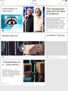
This virtual environment is comprised not just of people but also non-human agents, like technology. Therefore it should be seen as an assemblage. The links I tweeted were related to this idea: a vision of the internet that allows communication with other species, and examples of memes that rely on animal metaphors. The latter is interesting because it shows how human communication is shaped if not directly by other species but by how we view them.

I am quite happy to have developed the video in a way that allows multiple interpretations. For instance, after I re-read Sian Bayne’s critique of TEL, I realised that a virtual environment, an online course even, is someone’sperspective. This imagined world reflects biases and prejudices, and if we are not careful may put some groups at a disadvantage. Bayne’s critique of TEL emphasizes a sensitivity to the context of technology adoption, and calls for an examination of its goals, especially because those goals are often unarticulated.

As a corporate trainer, I can see the instrumental view on technology in how elearning courses are developed: efficient delivery of training content is the primary focus. How a course impacts trainees (as people not just workers), work processes and other activities are often treated as secondary concerns.

Week 2 summary: virtual reality

This week I was a bit more focused and posted a couple of tweets only, but focused on one subject, still the relation between bodies and information technology. I posted an interview on a type of biohackers known as grinders, and also posted the link with a reply on Katherine’s post. I was web surfing when I came across an idea that making a value judgement is one test for identifying artificial intelligence so I made a tweet about Siri.

I was surprised to find references to transhumanism quite prevalent. I posted my thoughts on wearable technology. I was unable to attend the second film festival but I posted my interpretation of the dark video, We only attack ourselves, as a response to Ben’s post.

The video Address is Approximate was a useful jumping point to think about virtuality and non-conscious cognition (a term I stumbled upon through a Hayles interview on Youtube.) It is quite easy to imbue the robot with character or personality but I realised that the film festival heading, machine sentience, suggests that this is not necessarily the case. It is possible to have non-personal learning agents.

Mainly this week, I have been thinking about my artefact assignment and will try to blog about some of the themes that I am considering at this stage: virtuality and the blurring of boundaries.  I’ve worked on the images and am trying to figure out a structure that ties them together.